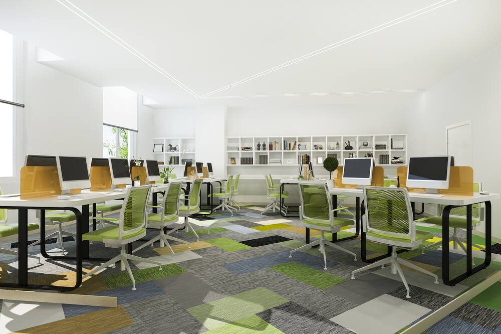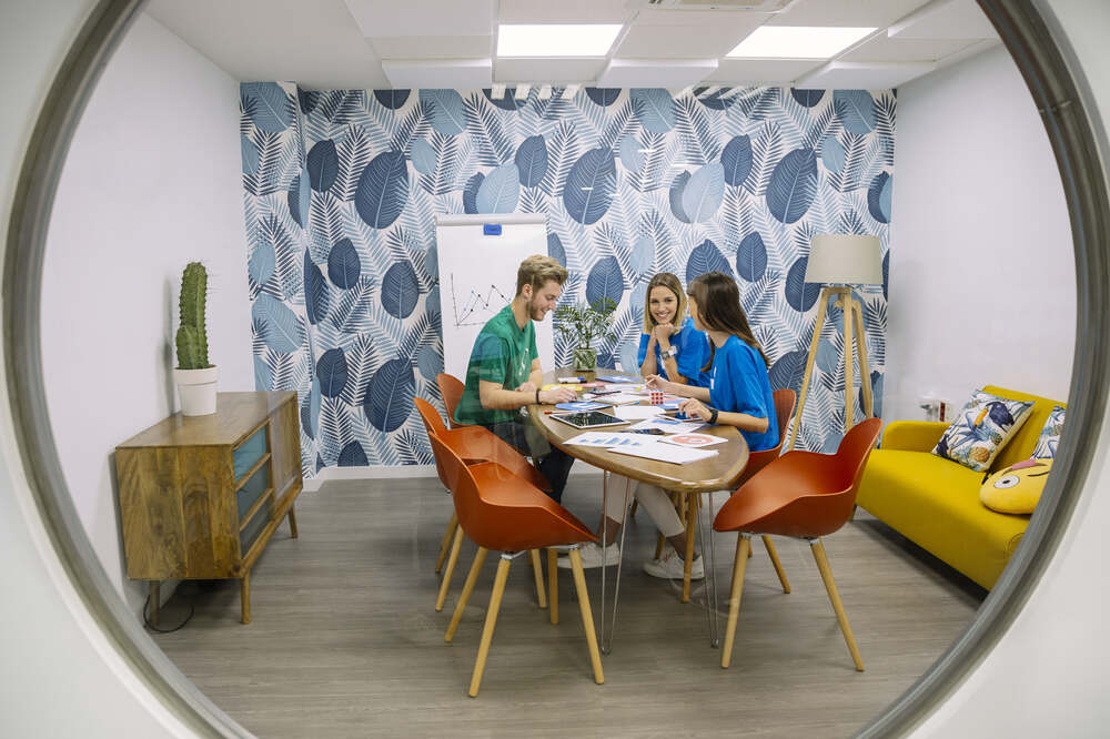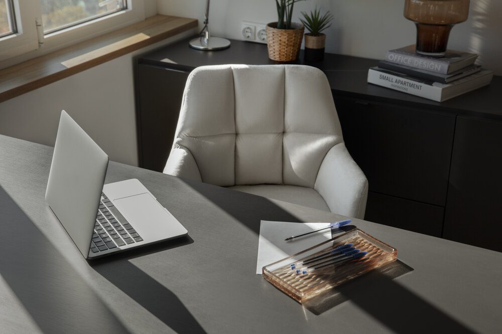
Color is a dynamic element that shapes mood, prompts action, and impacts physical responses, playing a crucial role in office design to boost productivity and support well-being. Color psychology in offices explores how different hues influence emotions, behaviors, and interactions, offering businesses a strategic way to optimize their workspaces. Companies can create environments that inspire creativity, foster collaboration, and promote mental and physical well-being by integrating purposeful office design colors and prioritizing workspace mood design.
Here are five ways color psychology impacts office design.
Key Takeaways✔ Thoughtfully chosen office design colors, like green and yellow, can directly boost productivity by promoting focus and energy in specific zones. ✔ Warm tones, such as orange, and calming hues, like soft pink, can create a positive and welcoming work environment that reduces stress and fosters social interaction. ✔ Aligning office design colors with brand identity, such as incorporating red for energy or blue for trust, strengthens the company’s image while enhancing employee engagement. ✔ Calming colors like green and lavender in wellness zones support employee well-being by reducing stress and creating restorative spaces. ✔ Vibrant tones such as yellow and coral energize collaborative spaces, fostering teamwork and sparking creativity during group activities. ✔ Integrating color psychology in offices into furniture selection enhances functionality, reinforces mood design, and creates cohesive, productive, and visually engaging workspaces. ✔ Transitioning colors seasonally with temporary elements, like pastels in spring or warm tones in fall, keeps the office visually engaging and aligned with the time of year. |

Understanding how color psychology in offices impacts productivity is vital for creating efficient work environments. Colors influence energy levels, focus, and motivation, directly affecting how tasks are performed. Businesses can enhance productivity in various areas of the workspace by using thoughtful office design colors.
The right office design colors can transform a workplace into a welcoming and uplifting environment as 90% of first impressions come from color. By using color psychology in offices, businesses can reduce stress, improve morale, and promote harmony among employees. Thoughtfully designed spaces enhance the overall mood, making workdays more enjoyable and productive.
Office design colors play a crucial role in reflecting a company’s brand values and culture. Aligning colors with branding strengthens recognition and reinforces the organization’s identity within the workspace. Employees and visitors alike benefit from a cohesive environment that reflects the company’s mission.
Prioritizing color psychology in offices can significantly impact employee health and wellness. Specific office design colors help reduce fatigue, improve mental clarity, and create spaces that support physical and emotional well-being. A wellness-focused design fosters happier, healthier employees.
Workspace mood design significantly influences how employees interact and generate ideas. The right office design colors can stimulate collaboration and inspire innovation across teams. Strategic use of vibrant and dynamic tones creates engaging spaces that encourage teamwork.
Office furniture plays a significant role in reinforcing the effects of color psychology in offices. By combining functional design with carefully chosen office design colors, businesses can create workspaces that enhance mood, productivity, and collaboration. Integrating color psychology into furniture ensures a cohesive and visually appealing office environment that aligns with workspace mood design principles.
Office chairs in calming shades like muted blues or greens can help employees concentrate during long hours of focused work. These tones promote mental clarity and relaxation, reducing stress and boosting efficiency. Ergonomic chairs in these colors also provide comfort while aligning with the overall workspace mood design. Using matching or complementary hues in chair upholstery enhances visual harmony.
Brightly colored furniture, such as red or orange chairs and tables, stimulates energy and encourages interaction in collaborative spaces. These colors are particularly effective in meeting rooms or brainstorming zones, where active participation is essential. Pairing bold furniture with neutral surroundings prevents overstimulation while maintaining a vibrant atmosphere. Highlighting these hues in moveable or modular pieces allows flexibility.

Desks in neutral shades like white, gray, or beige provide a clean and versatile foundation for productivity. These tones balance the workspace and reduce distractions, making them suitable for both individual and shared workstations. Neutral desks complement more vibrant accents in the office, ensuring cohesion with broader office design colors. Adding subtle color highlights, such as drawer handles or edges, can personalize the design.
Bright storage units in yellows, teals, or pastels can energize creative workspaces and improve organization. Open shelving in lively colors adds personality to the office while keeping essential items accessible. These tones also break the monotony of neutral areas, inspiring innovation and a sense of playfulness. Combining bold storage with functional layouts ensures practicality without sacrificing style.
Lounge chairs and sofas in warm tones like coral, terracotta, or soft pinks create a welcoming and relaxing environment. These colors encourage social interaction and provide comfort in breakrooms or reception areas. Incorporating plush textures alongside these hues further enhances the calming effect. Blending warm tones with natural materials like wood adds an organic touch to the design.
Conference tables in brand-aligned colors like deep blue, green, or red can reinforce company identity during meetings. These tones set the mood for professionalism, trust, or energy, depending on the chosen color. Adding subtle color accents, such as table edges or embedded patterns, allows customization while maintaining sophistication. This integration of color psychology in offices strengthens branding and focus.
Seasonal changes offer a natural opportunity to refresh office design colors and adapt the workspace mood to the time of year. Transitioning colors can enhance employee well-being, maintain visual interest, and create a dynamic work environment that reflects seasonal vibes. With careful planning, businesses can incorporate color psychology in offices to match seasonal energy while maintaining functionality and brand alignment.
Autumn is an ideal time to incorporate warm hues like burnt orange, mustard yellow, and deep reds into office spaces. These colors evoke coziness and help employees feel grounded during shorter, cooler days. Add these tones through soft furnishings, rugs, or wall art to create a welcoming environment. Warm lighting can further amplify the seasonal effect, complementing the overall workspace mood design.
Cool tones like aqua, mint green, and soft blue are perfect for creating a refreshing and light atmosphere during summer. These office design colors mimic the serenity of water and sky, fostering a sense of calm in high-energy months. Swap out heavy curtains or dark accents for lighter materials in these tones to enhance natural light. Adding greenery can also amplify the summer vibe while improving air quality.
Winter months call for festive touches that align with cultural or holiday themes while maintaining professionalism. Deep greens, golds, and silvers can be subtly added through table settings, wreaths, or accent walls. Using warm whites for lighting can create a soft glow that enhances these colors. This seasonal adaptation promotes a cozy and cheerful workspace mood design without overwhelming the office.
Spring is synonymous with renewal, making pastels like soft pink, lavender, and pale yellow excellent choices for seasonal updates. Incorporate these tones through desk accessories, cushions, or temporary wallpaper. These light office design colors uplift the mood and reflect the season’s themes of growth and energy. Pairing pastels with fresh flowers or natural elements enhances the springtime atmosphere.
One of the simplest ways to transition office design colors is by rotating artwork, photography, and décor to match the season. For example, use autumnal landscapes or winter-themed abstracts to reflect the time of year. This approach allows businesses to adapt quickly without major renovations. Choose pieces that integrate seamlessly with the existing color scheme to maintain a cohesive look.
Temporary elements such as throw pillows, chair covers, and rugs make it easy to transition workspace mood design for each season. Opt for items in seasonal colors that can be easily swapped out as the months change. For example, use light floral patterns in spring and warm plaids in winter. This cost-effective approach keeps the office visually engaging without long-term commitments.
Yes, color psychology can significantly reduce workplace stress by incorporating calming colors into the office environment. Shades like soft blues and greens are associated with relaxation and can help lower anxiety levels. Incorporating these colors into break rooms, quiet zones, or wellness spaces provides employees with areas to decompress. When combined with natural light or biophilic elements, these colors can further enhance stress relief.
Cultural differences can play a major role in how colors are perceived in office spaces. For example, in some cultures, red symbolizes luck and prosperity, while in others, it may be associated with caution or danger. Businesses with diverse teams should consider these cultural nuances when choosing office design colors. Conducting surveys or seeking input from employees can ensure that the color scheme is both inclusive and effective.
Bold colors can be used effectively by applying them as accents rather than dominant elements. For example, a vibrant orange can be incorporated through artwork, furniture, or feature walls without overpowering the space. Pairing bold tones with neutral colors like gray or beige helps maintain balance and professionalism. Using bold colors in specific areas, such as brainstorming rooms or lounges, can create a dynamic yet controlled design.
In remote or hybrid setups, color choices in home offices or shared spaces still play a critical role in productivity and mood. Cool tones like light blue can help improve focus for individual tasks, while warm accents like yellow or orange can create energy in collaborative virtual meetings. Businesses can provide employees with guidelines or resources for incorporating color psychology in offices into their home workspaces. Encouraging uniformity in color schemes across hybrid setups can help maintain a cohesive company identity.
Certain colors may have negative effects if used excessively or inappropriately in office spaces. For instance, overly bright red can cause agitation or stress, especially in high-pressure environments. Similarly, too much black or dark gray can make a space feel heavy or oppressive, reducing employee morale. Careful consideration and strategic use of these colors in moderation can help avoid unintended impacts on employee mood and productivity.
Transform any office into a productive and stylish environment with Stamford Office Furniture, the trusted source for premium office furniture in New Haven, CT. Offering an extensive selection of ergonomic chairs, functional desks, and versatile storage solutions, Stamford Office Furniture provides designs that prioritize comfort, efficiency, and modern aesthetics. Elevate workspace potential with high-quality furniture designed to enhance performance and leave a lasting impression.